Today we will be looking at the Audience report in Google Analytics. There is a whole bunch of detailed reports and valuable insights to be had if you know where to look.
Without the know-how, it can be confusing so we will break down each report and give a broad analysis of how to use them.
This is our second post in the Google Analytics series. The first one is on Realtime Reporting.
Audience Overview Reporting:
This is the broad strokes evaluation of your audience viewable from the main dashboard. You set a date range that you want to analyze, you can even compare dates.
The default overview also shows you:
- How many users.
- How many sessions.
- How many page views.
Where the views came from and what language they browsed in.
The most powerful part of Audience reporting is you can do deep diver analysis of your traffic using dimensions, metrics, demographics, and technologies.
In the below example we have selected to see only New Users (Dimension), how many pages new users view on average (Metric), and what city they are from.
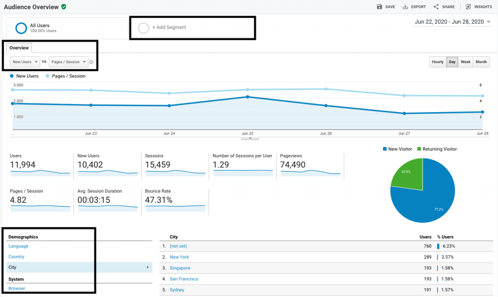
By changing the dimensions and metrics you can start to build demographic profiles of your viewers. Or in marketing speak – buyer personas.
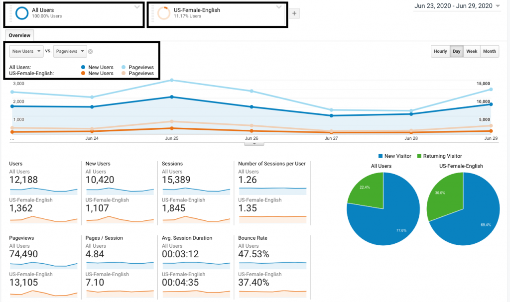
You can also create segments that can filter out different traffic sources. In the example below, we have added a segment to compare, we want to see how my female users in the US compares to my new users.
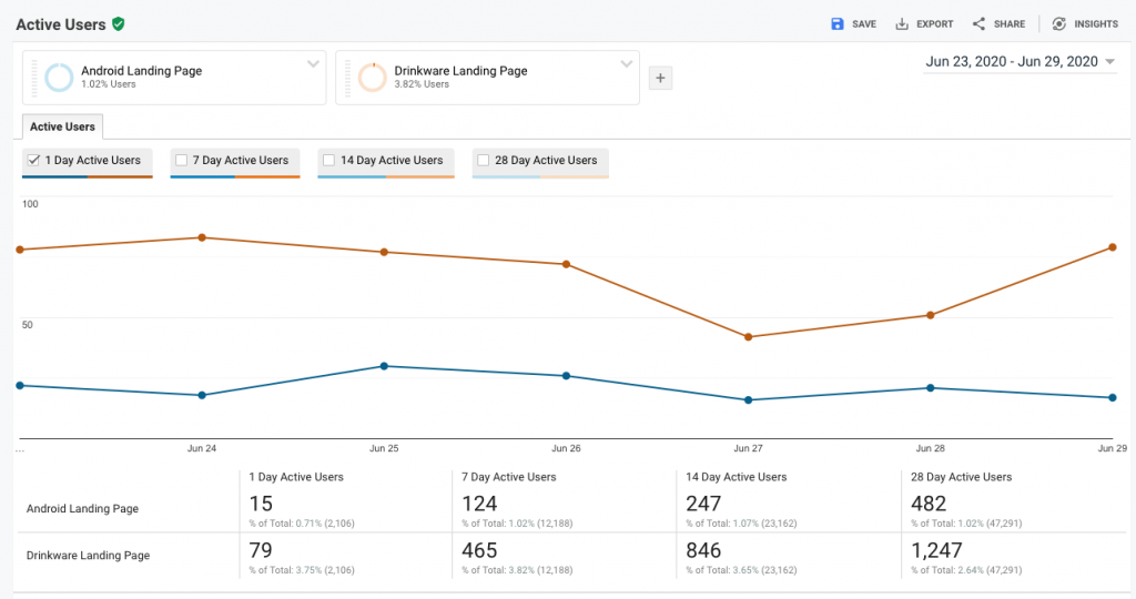
Active User Report:
The Active User Report shows you how many active users you had over a set number of days. It’s cumulative, so the more days you have, also the more active users you’ll have too.
This report helps you understand your site’s content performance, be wary of sharp declines – and make not of sharp increases
Helps you understand:
- How content is performing over time.
- Decreases indicate less viewership.
- Increases represent growing viewership.
In the below example we are comparing the active users of our recently made Android Landing Page, to the popular Drinkware landing page. Going by this report the Android Landing Page still has some catching up to do to catch up in users and sessions.
Lifetime Value Report:
The lifetime value report is probably the most important report in the entire Google Analytics suite. This report lets you understand the average LTV of any customer within the first 90 days of acquisition.
Helps you understand:
- The Lifetime Value of Users in a 12-week window from acquisition.
- Which sources provide the most value.
It also shows you what traffic sources provide you with the most LTV revenue and the most LTV revenue per user.
In the example below, we are looking at acquisition taken over a 2-year period (Acquisition Date Range) and are comparing both Sessions and Revenue Per User.
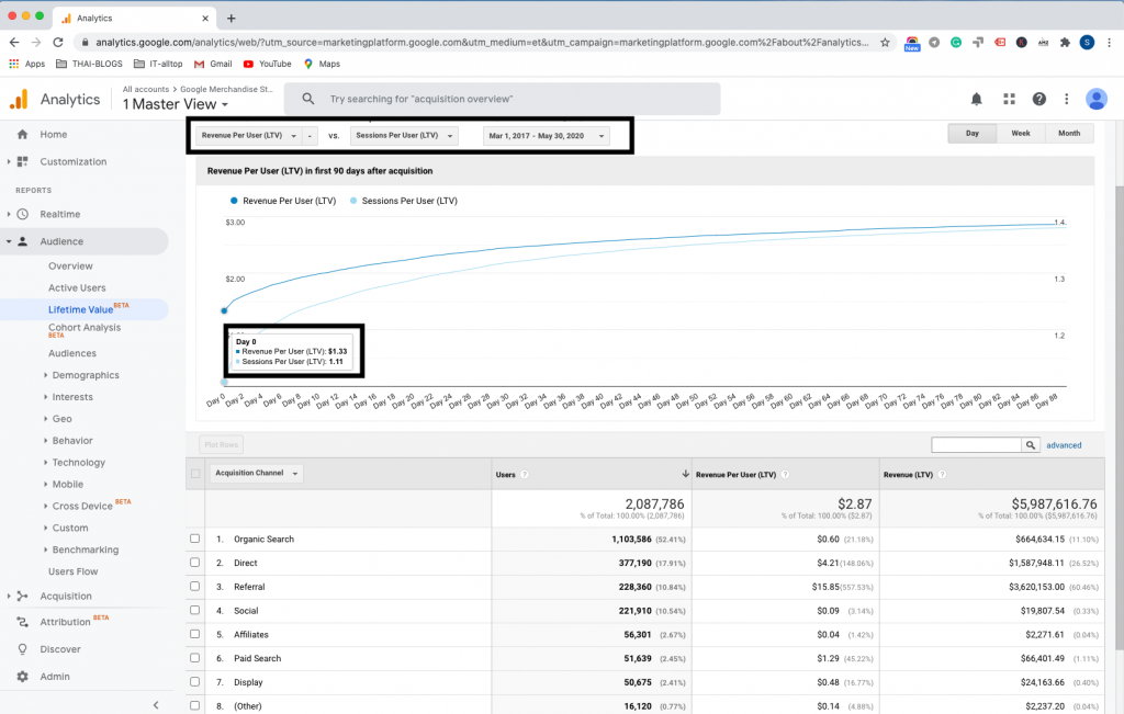
We can see that the average day 0 acquisition value is $1.33, but over 90-days it grows to $2.87. Referral traffic is both the biggest earner in total revenue and per user LTV.
Cohort Reporting:
Cohort reporting is one of the most underrated reports inside Google Analytics. Cohort reporting lets you analyze users who share a common characteristic, you can review how they engage with your site over time.
Cohort Type: This can only be “Acquisition Date” inside – this is the Cohort grouping.
Cohort Size: How do you want the cohorts grouped: day, week, or month.
Metric: What other commonality do you want to evaluate. You can see pick recurring views, transactions.
Date Range: Up-to a 12-week windows you can evaluate cohorts.
In the example below, we are looking users acquired in March, April, and May. We are looking to see how many transactions they conducted in those months and also if they purchased again.
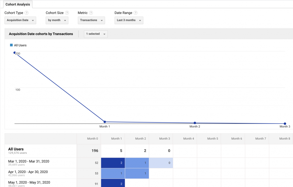
We can see that purchases in March, bought more things from April and May. Whereas users who purchased in May, although there were more, didn’t continue to buy.
Helps you understand:
- Short-term marketing efforts: Understand the LTV of running campaigns..
- Common points of attrition: If you see viewership decline in week 3 – this maybe can be remedied by email outreach.
- See at what rate attrition occurs and then how many new users you need to grow your business
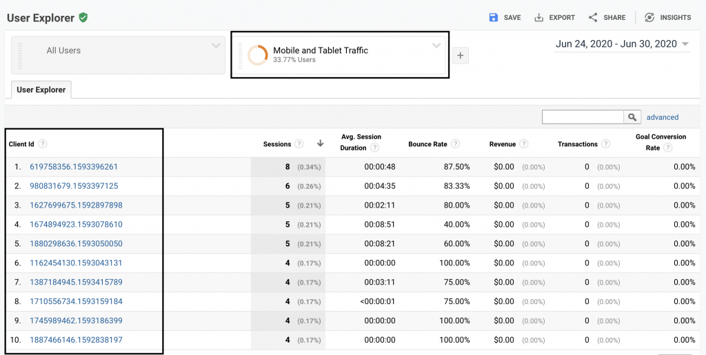
User Explorer Reporting:
This report lets you examine individual behavior at session level, instead of aggregated data. You would think that individual use cases would have little value, but they can help you remedy problems.
For instance, if you found that your viewership using mobile devices has a high bounce rate – you can deep dive into each individual mobile user. By going person-by-person, you can get a more comprehensive view of the problem and remedy it.
In the below example, we have done mobile device analysis: By clicking the Client ID I can see how people are using my site and pinpoint where the failings are.
Helps you understand:
- The individual buyer journey in a linear model.
- Important pages and content that leads to a goal.
- Critical nuances that can be missed inside big data.
Demographic Reporting:
This report helps you understand the core demographics of your audience. From the overview, you can see which age and gender most use your site.
Once again you can use segments to understand what types of users are coming to your site, from where and if they convert.
In the below example I am looking to evaluate which age demographics use my site and which purchase. As you can see my users view and purchase in almost equal percentages. But this isn’t always the case.
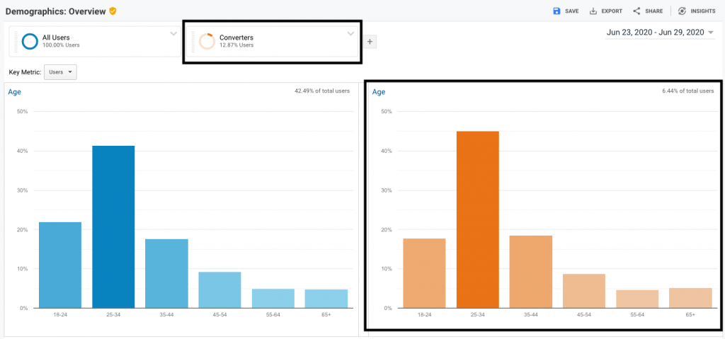
Helps you understand:
- If the content you are making is attracting the right viewership.
- Understand who your high-value customers are.
Interest Reporting:
Usually, Age and Gender demographics in isolation will not give you enough information on your users. What you really need to understand is what interests them. In the below example we are looking at the interests of our total viewership and the interests of our buyers.
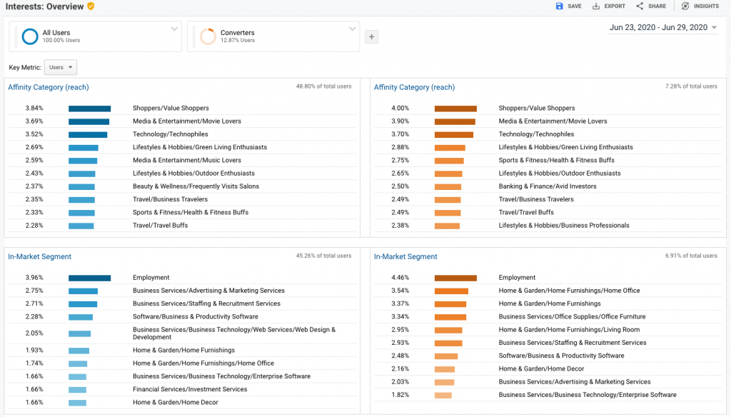
Helps you understand:
Affinity Categories: Related to hobbyists, researchers, or people high in the conversion funnel for that particular topic.
In-market Segments: These are people that Google believes are looking to buy in these respective categories. In our example above, this means a lot of our buyers, are looking for jobs too.
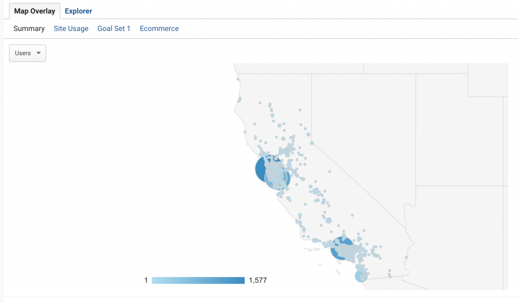
Geo Reporting:
This report helps you understand how your content is performing in different locations and languages. Just because you are interested in a specific region doesn’t mean that a specific region is interested in you.
Helps you understand:
- Effectiveness of advertising in different languages and locations.
- Where are the best geographical areas to expand your reach?
In the example below, California (our best performing commercial state) has two pockets of transaction activity in San Franciso and Ontario. Maybe we should increase our marketing spend in these areas to take advantage of a high performing geographic area.
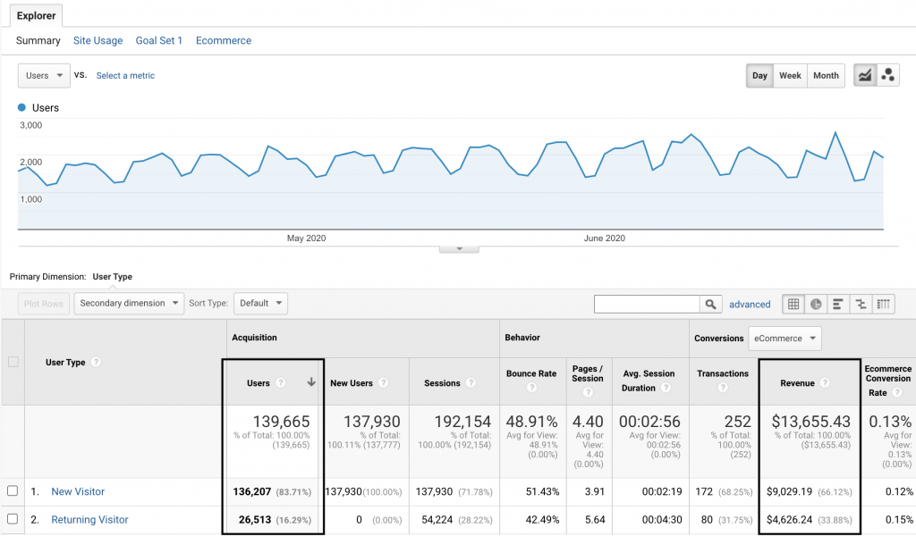
Behavior Reporting:
This report helps you understand how users interact with your content, how often they come back, and the general quality of the user visiting your website.
Using this report you can evaluate the pull of your site (how many returning users you have) and also the value of those returning users.
In our example below returning users make up only 28% of sessions but 31% of transactions.
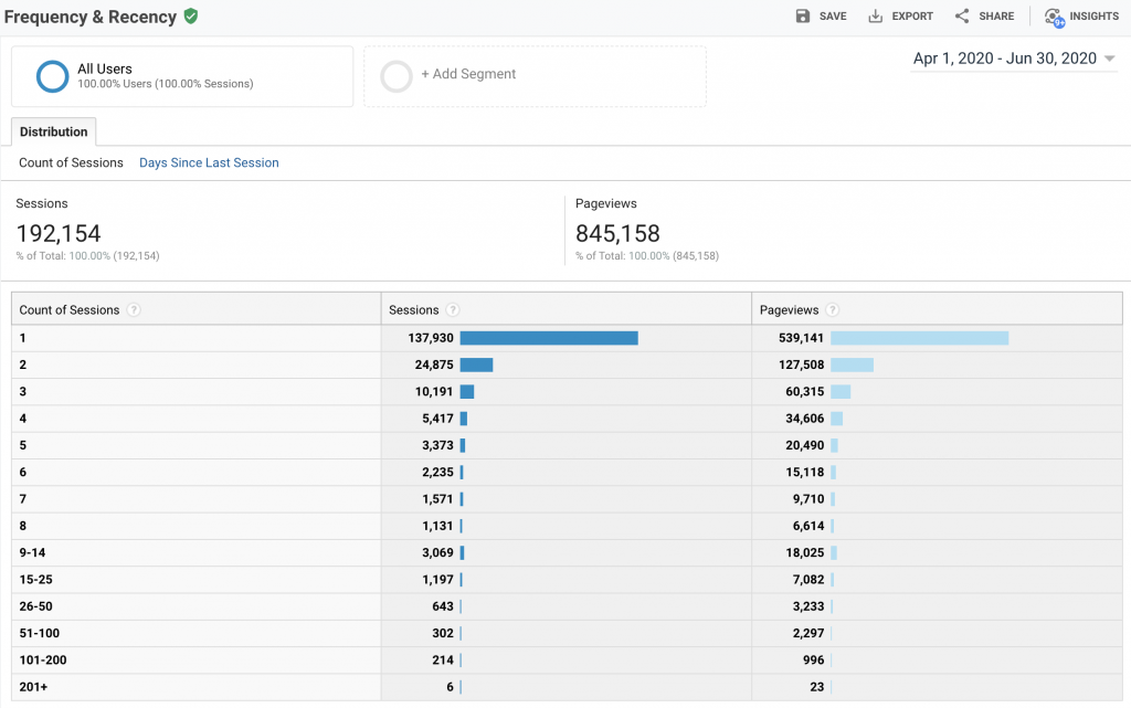
Frequency and Recency: How often users come to your site, and how recently they returned. This report shows you the cumulative page views and the number of sessions.
Count of Sessions: This is how many sessions happened.
Sessions: How many users had that session count.
Pageviews: How many pages view each session made including repeat views.
In our example below you can see: 137,930 users have had 1 session (this is everyone who visited the site), of that 137,930 users 24,875 came back for a second time and 10,191 for a third.
Days since the last session shows how often people have returned in a give time frame and how long it took them to return.
Helps you understand:
- How sticky your content is.
- How frequently users come to your site.
Engagement:
When evaluating if users like your content on not, you consider two dimensions – one is session duration, the other is page depth.
Simply, how long do they stay and how many pages do they view. In the below example you see the value of an engaged user base. I segmented out users who made a purchase (a tiny 0.29% of sessions) – but over 30% of total conversions viewed 20+ pages.

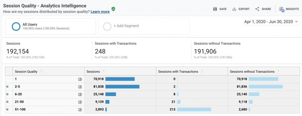
Session Quality:
This is an estimate given by Google that gives a numeric value (1-100) indicating how close a user was to converting. Your goal as a marketer is to get as much high-quality traffic as possible – Google assigns high-quality traffic as having a score of between 51 – 100.
Conversion Probability: This works similarly to Session Quality, this evaluates users’ likelihood of conversion. You need eCommerce tracking set up to put in place conversion probability. Google uses data modeling to determine the Conversion Probability of an individual within 30days.
Helps you understand:
- What channels are driving high probability users.
- What low pages do low scoring converters use, can we improve?
- What conversions paths are the most effective.
Technology Reporting:
This helps you understand what technology your users are using while on your site. This is useful as is keeps you abreast of your user’s migration to mobile and ensures your site if fully functional across browsers, devices, operating systems, screen resolutions, and more.
Mobile Reporting:
This report helps you understand what mobile technology people are using when they browse your site.
Cross-Device Reporting:
In the past, you were not able to track your users across devices. One cookie would be assigned to a desktop, and one to mobile – even though it was the same user.
Cross-device reporting now means you organize the same users across devices for cohesive analysis so you get a better idea of how seemingly unrelated interaction is actually connected. You might discover users that users browse on mobile but actually buy on their laptops.
Helps you understand:
- How different touch-points impact your conversion funnel.
- User flow across devices.
Custom Variable Reporting:
Using Java inside your Google tracking snippets you can create alerts in your reporting. This can be done at page, session, or visitor level.
For instance, you may want to have an alert every time someone removes a product from their cart. This can be set up at the session level, by putting in the following code:
_gaq.push([‘_setCustomVar’, 1, // This custom var is set to slot #1. Required parameter. ‘Items Removed’, // The name acts as a kind of category for the user activity. Required parameter. ‘Yes’, // This value of the custom variable. Required parameter. 2 // Sets the scope to session-level. Optional parameter. ]); _gaq.push([‘_trackEvent’, ‘Shopping’, // category of activity ‘Item Removal’, // Action ]);
Benchmark Reporting:
This allows you to compare your data with aggregated industry data from other companies. This provides meaningful context achievable targets and allows you to gain insights into trends and compares you to competitors. You can compare similarly sized businesses using daily traffic gauge.
In the below example, we are comparing consultancy businesses worldwide with 1000 – 4999 hits. Comparing how much traffic we get and from which channel: You can run this report to compare traffic channels, traffic locations, and the devices users use.
Userflow Reporting:
Userflow Reporting is a visual report that shows how users maneuver through your site. It gives an easy to understand birds-eye view of your site’s content so you can identify where the big drop-offs are.
To use the report you should start with a dimension. This can be user, behavioral or acquisition-based. In our example below, we pick a country of origin:
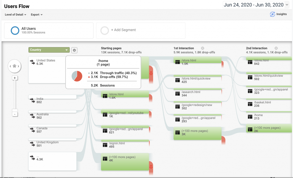
As you can see, from the United States, we get 6.3K users, of those 5.2K, go to the home page first. Hovering over the Starting page from the US we can see that there is a 3.1K drop-off (almost 60%). This means 60% of US traffic, that lands on /Home – make no further interaction with our site.
We hope this gives you some insight into how audience reporting works and that all the sections mean. We will be writing in more detail about the more complex elements in later blog posts.
If you would like to get more from your data – we can support you with PowerBI, SAP B1, or Data Analytics. If you are an eCommerce business looking to get more from Google Analytics we can support you with eCommerce development and marketing consultancy
Digital Marketing Manager at Aware Group: Working his way through the world of technology and Thailand as best as he can. Happy to contribute to other tech publications.

